
What makes you look at this dish first?
A Plating Gym critique of Adam Handling's Balmoral chicken, and what it can teach us about directing someone's eye.
All right, my fellow Plateists. If you’re a chef, a home cook or a food content creator who wants to take the visual side of your food a bit more seriously, I think one of the most useful things you can do is spend time looking at other people’s plates. It could just be the photographer in me but I feel its such an important skill to develop, understand and utilise.
Just go to the social media or cookbook of your favourite chefs. You’ll find plenty of beautiful food. But how often do you stop and work out why it looks so good?
Thanks for reading! Subscribe for free to receive new posts and support my work.
It’s easy to save a photograph because you like it, then get into the kitchen and find yourself wondering what to do with your own dish. You’ve got different ingredients, different plates and probably a lot less time. Where do you start?
That’s what these Plating Gym critiques are for. I’ll take a plate of food and work through what I see, looking at the design choices that make it work and what we can learn from them. Its how I analyse my own photography but you can do the same with any dish that catches your eye.
For me, this is a useful way to train yourself to notice things visually. The first time you look at a dish, you might just like the overall impression. Look a bit longer and you start to see that a repeated shape is drawing you towards the main ingredient, or that the garnish is getting far more attention than its size would suggest.
Once you can explain what’s happening, you’ve got something to try with your own food. You can ask whether a brighter garnish would help, whether the elements need to sit closer together, or whether you’ve given the most important part of the dish enough visual interest. It could even help you realise that something needs to be removed. One of this single most important skills in being a Plateist is knowing when to stop, when to let your design breathe and when to edit and remove an element. For talking with chefs, this is a true sign of confidence in your plating skills
That’s what I mean by understanding the visual language of food. Colour, shape, texture and spacing all affect how we read a plate. Getting more familiar with them gives you a better idea of what to change when something doesn’t look quite right.
And you don’t need to be cooking at this level to use any of it. These ideas apply just as much to a salad, a roast dinner or a slice of cake.
Of course, I can’t tell you exactly what was going through a chef’s mind. Some of these choices may be very deliberate, while others come from years of experience. What I can do is explain how the result works to my eye. You might see something different, and I’d love to hear about it.
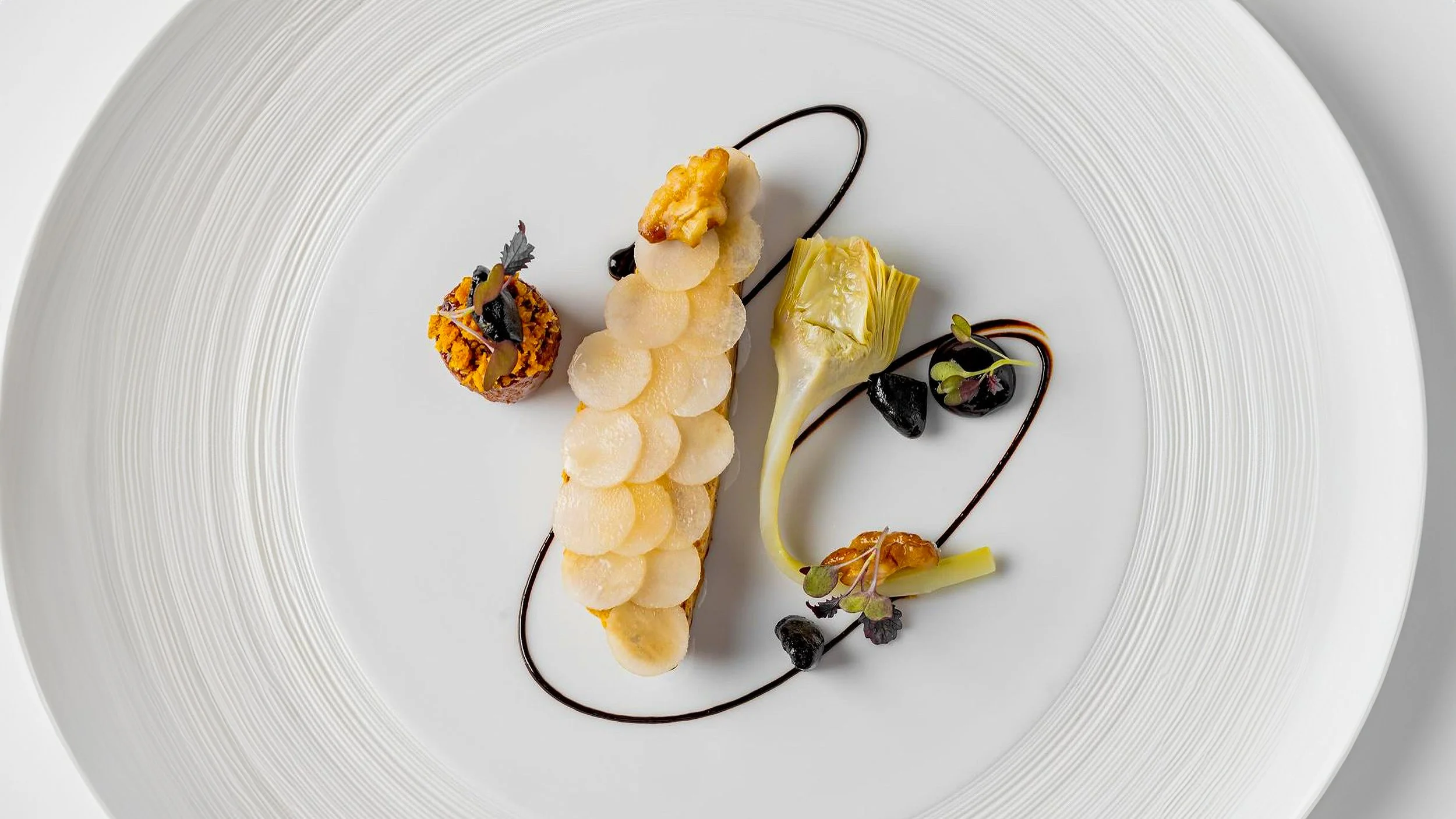
So, let’s have a look at Adam Handling’s Balmoral chicken.
You may know Adam through Frog by Adam Handling in Covent Garden. I’ve never eaten there, but I’ve certainly seen enough of his food to want to.
The dish brings together chicken, haggis and black truffle mousse, with artichoke, chicken sausage and crispy chicken skin. Crispy chicken skin is quite literally one of my favourite things, so I’m already in.
When I’m looking at any dish, one of the first places I start is colour. Here, it’s quite muted. You’ve got pale creams, golden orange tones and the green of the artichoke, with those almost black sauce lines providing a stronger contrast.
The garnishes follow the muted colours too. Often we reach for a garnish because we want a simple and bright pop of colour. Here, the darker leaves and softer greens fit into what’s already happening. They add detail without suddenly becoming the first thing you notice.
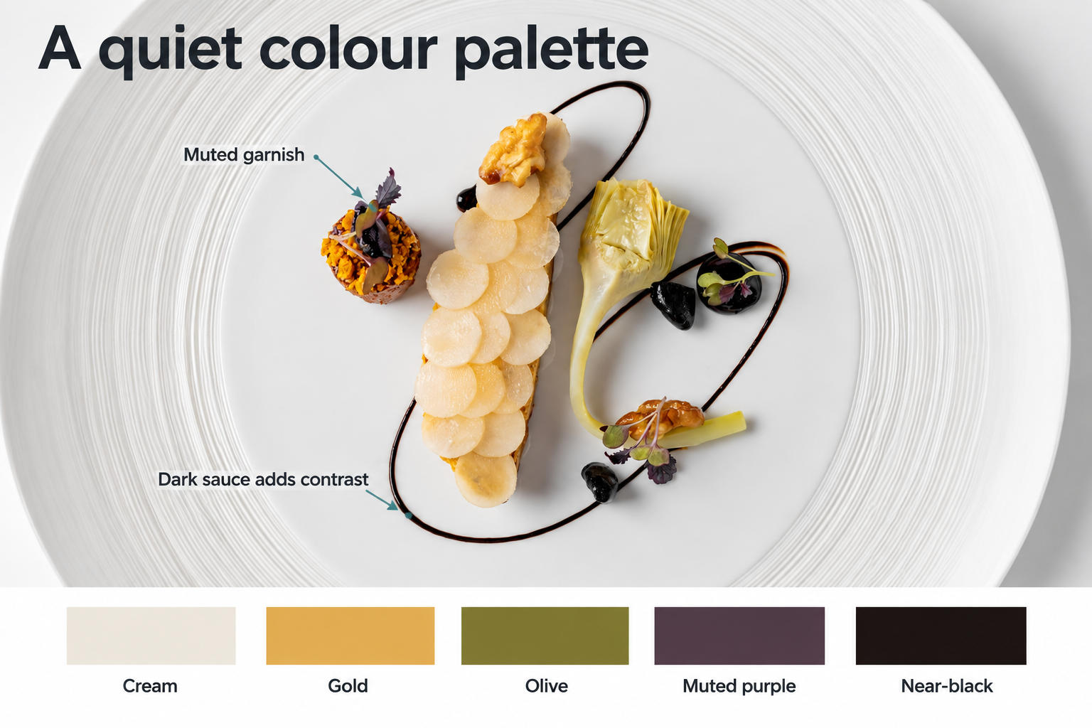
The darker sauce adds contrast, while the garnish stays within the muted palette.
It’s a lovely combination. But for me, colour isn’t the main star of this plate. The texture is.
Look at those overlapping circles along the chicken. I wouldn’t want to identify exactly what they are from the photograph alone, but what interests me here is what they do visually.
You’ve got the same shape repeated again and again, turning that long piece of chicken into something your eye wants to spend time on. There are edges, little shadows and a rhythm to the way they overlap. That repetition gives it more visual weight. By that, I mean it holds more of your attention and I love it
Then you’ve got the lines through the artichoke, the curl of its stem and the crumb on top of the sausage. There’s loads of texture, but it doesn’t all look the same.
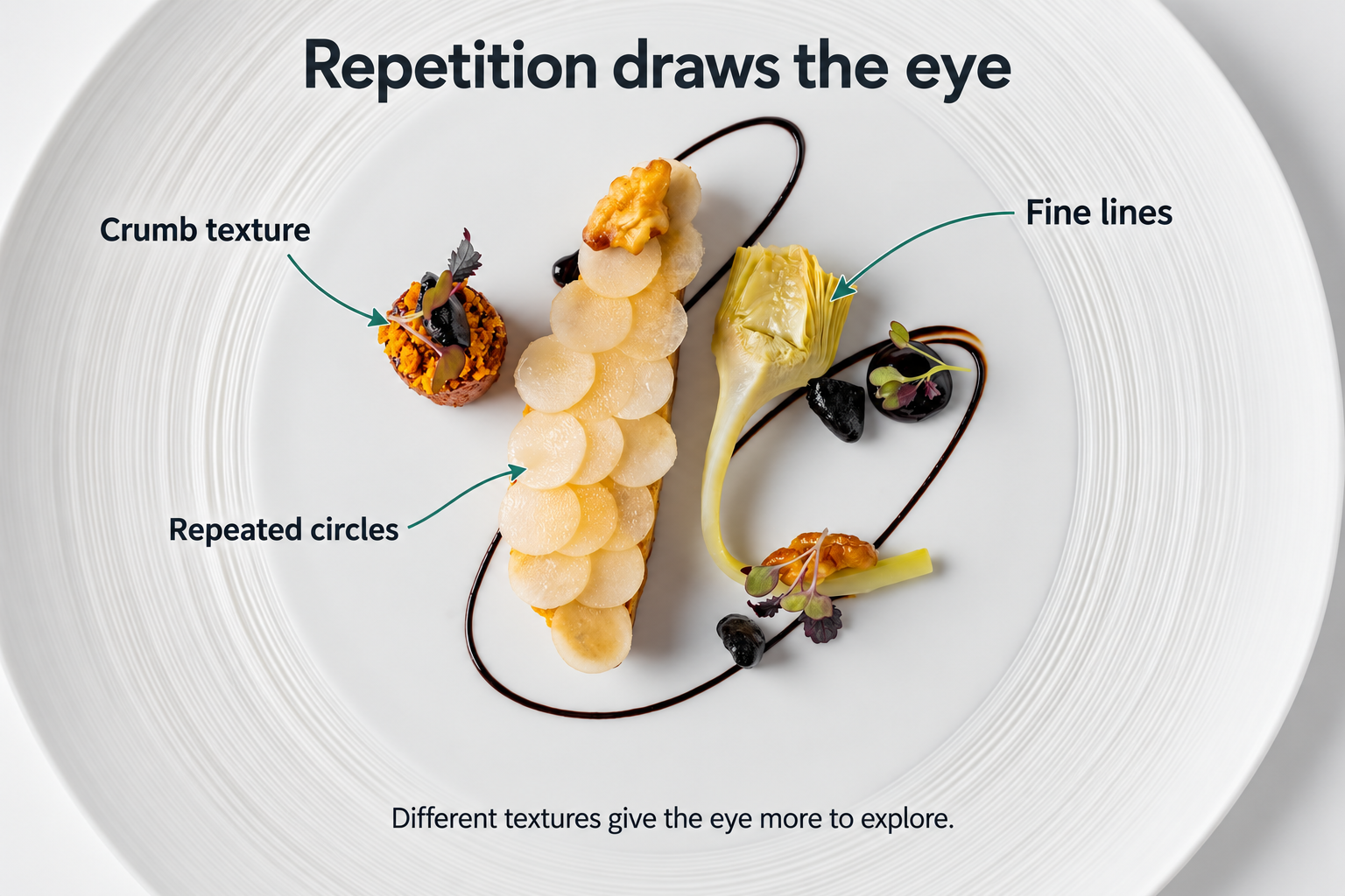
The overlapping circles hold my attention. The artichoke and crumb add different kinds of texture.
The positioning works really well too. There’s enough space to see the individual elements, but they still feel like they belong together. If you pushed them much further apart, you could start to lose that relationship.
Look at the little groups of garnish and you can trace an approximate triangle between them. Then follow the dark sauce around the food. Those curves help your eye move between the different parts of the plate, while the chicken gives you a strong line through the middle.
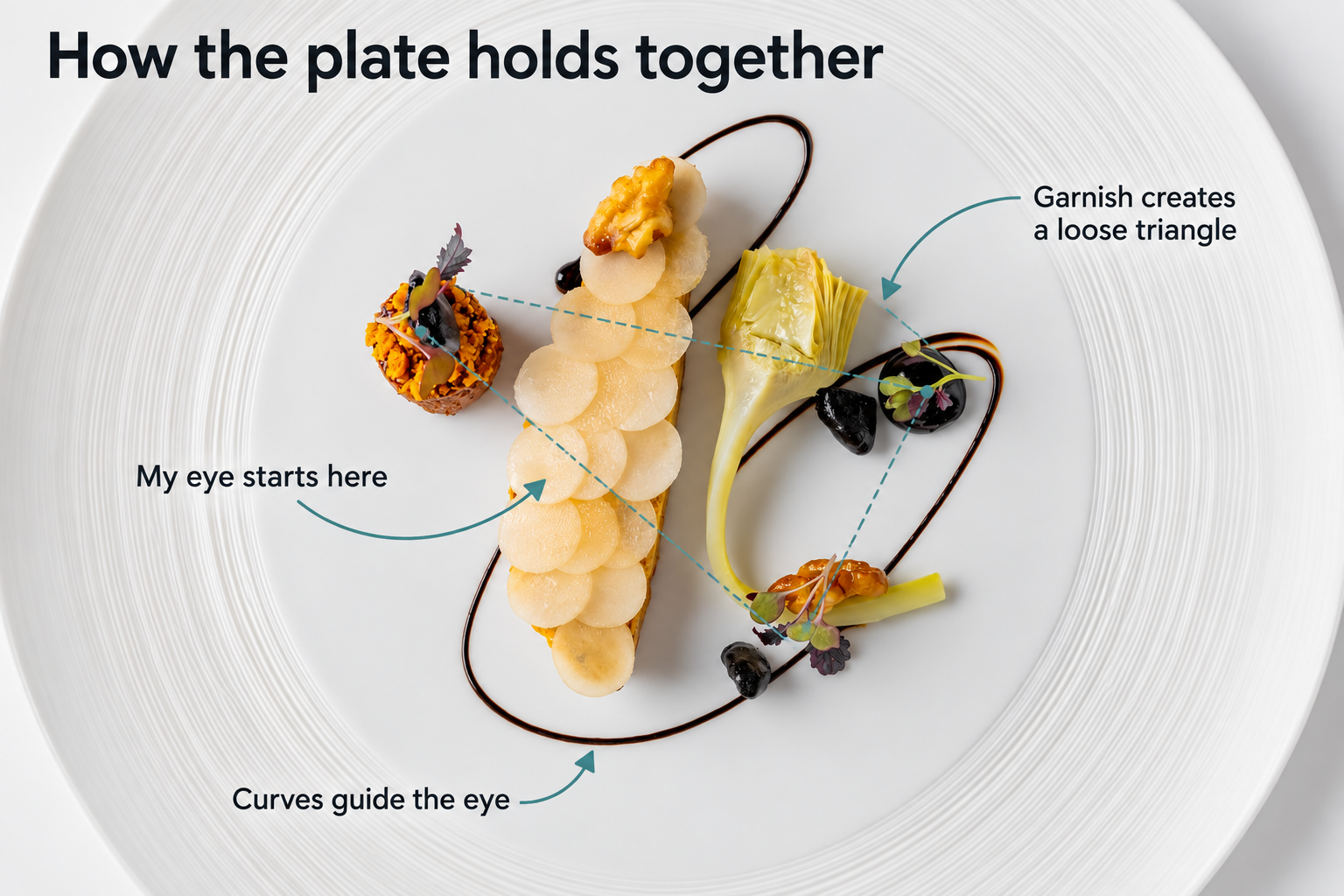
The garnish forms a loose triangle, while the sauce curves connect the composition visually.
Now, this could be me reading way too much into it, but there’s something almost Dalí-esque about this dish. The long shape of the chicken, the curling artichoke and those looping lines give it a slightly surreal quality. I’m not saying that was Adam’s intention. It’s just what I see, and it’s part of why I find it interesting.
Even the plate helps. At first glance, it’s a fairly blank white canvas. But the fine circular texture around the rim picks up on the curves and repetition in the food. There’s some detail there, without it competing with the precision of the plating.
So, what’s the most powerful visual element?
For me, it’s the chicken with the circles on top. That’s where my eye goes first. The other elements give me things to explore, but the chicken has the strongest presence. That’s visual hierarchy: some parts of the dish get more attention than others.
Whether Adam consciously thought through every one of those decisions, or arrived at them through experience, I can’t tell you. But we can look at the result and understand why it works.
You can use that understanding with whatever you’re cooking. Decide what you want someone to notice first, then look at whether the shape, texture and position of the food help that happen. Sometimes a garnish you’ve added with the best intentions is pulling all the attention away from the bit you’ve spent hours cooking.
Have another look at the photograph. Does your eye go to the chicken first, or is something else grabbing your attention?
Thanks for reading! Subscribe for free to receive new posts and support my work.